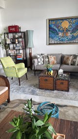
How-To Series: Achieve The Nordic Zen Look
The result is a pared-back but inviting aesthetic that is perfect for those who are taking a calm and serene approach to life, in this busy and cluttered world.
USE NATURAL MATERIALS

Don’t be afraid to mix wood colours - light and dark timbers such as oak, ash and walnut create interest when used as a contrast between flooring and furniture. Accessorize with raw or natural materials such as stone, ceramic, bamboo, hemp and more.
MIX MUTED, CONTRASTING COLOURS

from top: Keisoudo no Tokei Green Clock, Divide Black Clock, Portland Ivory Rug, Tassell Poufs in Navy and Taupe | photo by The Design Chaser
The fusion of Japandi allows for a wider range of colours to choose from. Cool, muted tones like pastels are often used in Scandinavian design to make the space light and airy, while the Japanese use warm, earthy colours.
For a dramatic but aesthetically cohesive look, stick to a monochromatic colour scheme with strategic pops of contrasting colours: a darker, saturated neutral base with light-coloured wood; or a light base with accents of cool, dark colours like onyx or deep blue.
CLEAN LINES, SMOOTH CURVES

clockwise: Trivet Sika Tray Table, Peranakan Peony Woodblock Print, Lines Clock, Braided Serenity Rug | photo by The Design Chaser
Sleek lines and flawless craftsmanship in Scandinavian and Japanese furniture make them statement pieces on their own, thus minimizing the need for an abundance of décor. Scandi furniture has lighter colours and fluid contours, while Japanese furniture has darker tones and more defined lines, but both share a minimalist profile.
Strike a balance between contrasting elements to create visual interest – pair a big, high-impact statement piece with smaller furniture or soften hardwood furniture with linen covers and cushions.
ADD STATEMENT ACCESSORIES

clockwise: Carved Colored Blue Clock, Navi Reclaimed Rope Lamp, Mind Map III Print, Wabi-Sabi Rose Gold Tray | photo by Temple & Webster Australia
Scandinavian and Japanese rooms use accessories sparsely, but choose impactful pieces to ensure that the design still feels intentional. Scandi accent pieces often focus on the hygge concept or that of cosy contentment, while Japanese design takes inspiration from the concept of wabi-sabi, or embracing imperfection.
Give your space a warm, homey feel by making use of plush rugs, cushions and blankets; add a soulful touch by choosing storied pieces with natural textures, raw edges and rustic elements.


